top of page
Before
The original bag page had inconsistent use of typography, the function of the progress bar at the top of the page was not very clear and the buttons did not follow best practise. The overall layout and experience for the user was poor.

Research
Throughout the entire process of a project I study as many sources of data as possible so that I can tailor the user experience to our audience. In this instance we didn't have any testing tools to analyse pain points so I took the initiative to conduct research on existing brands to see the functionality of various bag pages for inspiration.
I then analysed my research in depth to conclude any key findings and common themes across the various websites I looked at and displayed them in their simplest form in preparation for presenting to key stakeholders.
100%
90%
90%
Displayed one primary button on the page

Displayed the components on the page using blocks.
Displayed the price on the right as well including a breakdown of the total.
Key findings
User flow
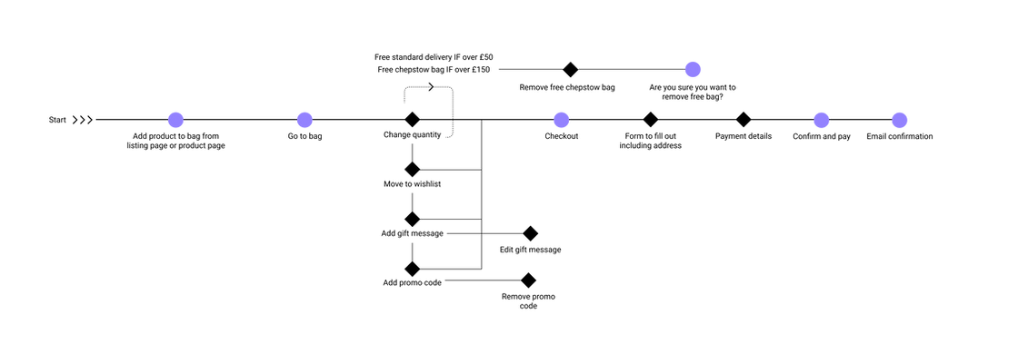
Mapping out the user flow was essential so I could focus on the journey the user would take from viewing products to purchasing and conversion. A flow represents an overall picture and gives me the opportunity to create a more seamless user experience.

Wireframing
After reviewing the current experience I began wireframing some basic options. Wireframing to begin with helps me iterate fast and share my ideas with key stakeholders before we commit to a solution. In this instance, I needed to design for both desktop and mobile.


Visual design
A fresh, modern redesign for the bag page using the existing style guide has been made. Improvements include a newly designed cross sell slider at the bottom of the bag page, an improved progress bar at the top which has been split into displaying different messaging only showing what is relevant to the user. Segregating sections using white blocks making it easier for the user to scan the page, as well as improved price breakdown and improved functionality for the user to add a gift message.


bottom of page

